Colour systems that survive fluorescent retail
A palette that looks authoritative in a studio will die under a supermarket, a hospital corridor or a service-station canopy. Australian identity work has to specify colour as it will be printed, lit and cheaply reproduced — not as it appears in a well-calibrated deck.
Priya Nair, Identity Editor · 18 February 2026 · 5 min read
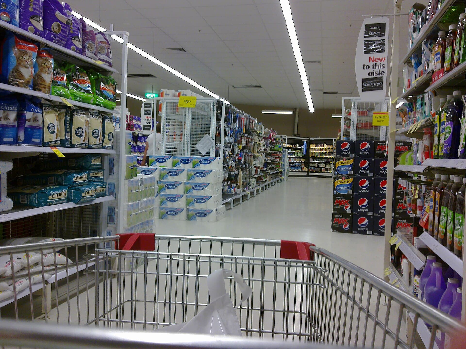
Australian retail light is not a mood. It is a fact. Supermarkets, chemists, big-box hardware, hospital outpatients, service stations, airport retail: the country’s most visited interiors are lit to sell stock and keep people moving, not to flatter a brand palette. Identities that ignore this come back as complaints. “It looks washed out.” “The pack disappeared.” “The fascia looks like a different company at dusk.” The agency then offers a “print tweak”. The tweak is an admission that colour was designed as decoration.
A colour system is a reproduction problem with a taste attached. The taste can be distinctive. The reproduction has to be specified for the rooms Australians actually enter.
Design under the worst honest light
Take the shortlist to a supermarket at 11am, a hospital corridor, a car park at dusk, and a cheap laptop in a meeting room with the blinds down. Those four rooms will kill more palettes than a critique. You are looking for three failures.
Collapse: two colours that were distinct on a calibrated monitor become one under fluorescent or on a phone. Disappearance: the primary vanishes against the category, or against the orange and red that already own Australian retail. Dirt: the colour looks cheap when it is printed on the stock you can afford, or when it is vinyl on a van that will be washed with supermarket chemicals.
Bunnings orange and Australia Post red are not sophisticated. They are survivable. They can be seen from a car park. They can be matched by a contractor. They have been allowed to become place. Most “sophisticated” palettes in the mid-market are sophisticated only in the deck. On a vehicle they look like a consultancy.
Specify the near-enough
Brand books love a PMS number and a hex. Signwriters love what the wholesaler has in the rack. Screens love whatever the last person who touched the CSS typed. If you do not write the near-enough — the acceptable commercial match, the fallback when coated stock is a fantasy, the hex that will be used when someone builds a landing page at 10pm — you have specified a laboratory, not a system.
Include:
Print: coated and uncoated, and the cheap digital that will produce most of the work. Screen: hex and a note about cheap laptops. Physical: vinyl, paint, fabric, and what happens when the only available match is a slightly wrong red. Environments: the colour on brick, on corrugated iron, on a glass door with reflections.
Then say what is not allowed. A state team that “warms up” the primary because a local printer suggested it is how unofficial brands get born. Warming up is a decision. Put it in the book or forbid it.
Contrast is accessibility and commerce
Colour contrast is not only a WCAG paragraph for the digital team. It is whether a price can be read, whether a wayfinding panel works for older eyes, whether a warning is a warning. Australian organisations serve older populations than the agency’s reference images admit. A pale sand on cream may look editorial in a journal (we can say this while sitting in one) and illegal on a form.
Test the palette on the actual objects: a form, a pack, a button, a parking sign. If the object fails, the palette fails. Do not invent a “digital-only” secondary system unless you are prepared to police two brands. Two systems is how a website and a store become strangers.
Category colour is not a prison, but it is a neighbour
Australian categories already have colours in the public mind. Banking leans deep blue and a cautious teal. Supermarkets own red, green and a fight over who is cheaper. Charities have colonised a certain hopeful yellow. Government clusters invent teals that last one machinery-of-government change.
You may fight the neighbour or sit beside it. What you may not do is pretend the neighbour is not there. A new fintech that picks a calm blue and a sans-serif is not differentiating. It is joining a choir. A pack that uses the category’s warning colour as a decorative accent will be misread as a warning. That is not the public being dim. That is the public being busy.
Seasonal and promotional colour is a leak
Retail Australia lives on catalogues and “this week” mechanics. Promotional colour — a burst yellow, a Christmas red, a pink for a health week — will be requested every quarter. If the system does not say how a promotion may sit next to the primary, the promotion will become a second brand. Write the rule: promotions may use a reserved burst colour, they may not recolour the mark, they must still pass contrast, and they expire. A burst that lasts eleven months is a new identity.
Own-brand and house-brand adjacency is the other leak. If you supply a supermarket, your colour will be seen next to a cheaper cousin. Distinctive hue plus a structural difference (shape, finish, a panel the house brand will not copy this year) is more durable than a slightly nicer tint of the same idea.
Digital merchandising adds a third leak. Thumbnail grids on an app are a new aisle, smaller and meaner. Test the primary at 64 pixels. If it becomes a brown smudge, you do not have a digital colour. You have a print wish.
Fewer colours, more discipline
Workshops add colours the way they add adjectives: to make everyone feel represented. The operations team then inherits a twelve-swatch system and a fight. Cut to a primary that can carry a vehicle, a secondary that can carry a document, a neutral, and one accent you are prepared to police. If a business unit needs its own colour to feel loved, the architecture is the problem, not the palette.
Review colour when the surfaces change — a new channel, a new print process, a merger — not when someone is bored. Boredom is how you get a “warmer, more premium” refresh that costs a year of inconsistency.
The test that matters
Photograph the colour on a van, a shelf and a phone, on the same day, in the same city, and put the three pictures on one slide. If they look like one organisation, you have a system. If they look like cousins who fell out, go back to the supermarket and start again. The slide in the studio was never the work. The aisle is.
Questions readers ask
- Why do brand colours look different in an Australian supermarket than in the brand book?
- Because the book was specified in a studio and the aisle is fluorescent, reflective and shared with a hundred other packs. Cheap print, vinyl and screens add a second distortion. If the system does not name those conditions, the colour was never specified. It was wished.
- How many colours does a mid-market Australian brand need?
- Fewer than the workshop wants. A primary that can be matched by a signwriter, a secondary that works on paper, a neutral, and a warning colour if you operate. Extra accent colours are how state teams invent unofficial brands.