Typefaces that do not pretend we are in Brooklyn
Australian brands keep buying the same international sans, then adding a slang glossary to prove they are here. Type is a civic choice. It has to work on a form, a fascia and a phone, in a country that already has a typographic climate. Distinctive does not mean imported.
Tom Whittaker, Language Editor · 11 March 2026 · 5 min read
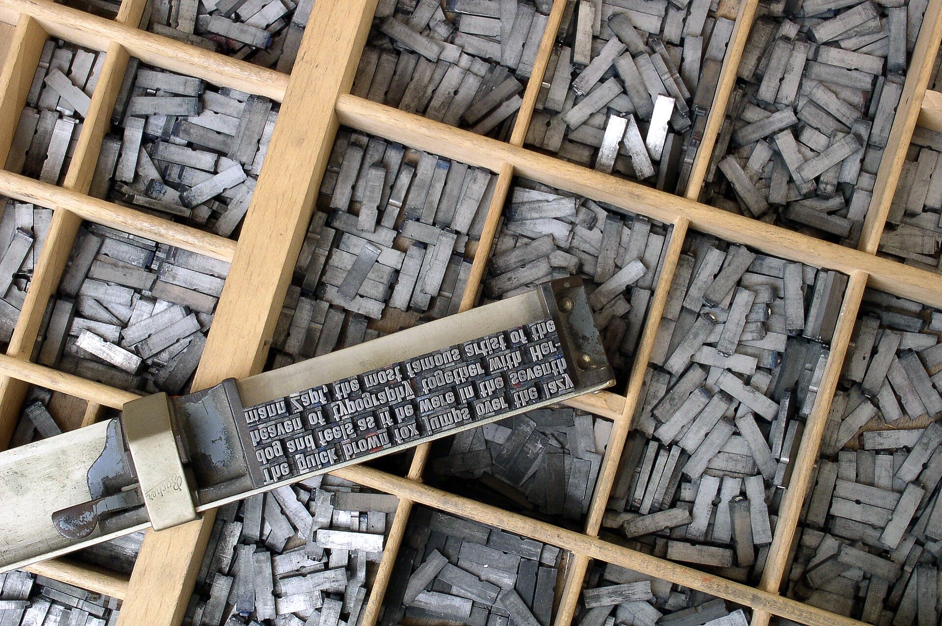
Open a new Australian brand book and you can often name the typeface before you reach the page. A reliable international grotesque. A slightly warmer neo-grotesque that had a good year in Europe. A serif reserved for “moments”. The accompanying voice chapter will insist on being unmistakably local. The letters will insist otherwise. This is how a super fund, a university and a gin brand end up sharing a skeleton.
Type is not a personality overlay. It is the climate in which every ordinary sentence will live: the form, the fare notice, the pack, the app, the tender, the apology. Australians read a lot of those sentences under bad light, on small screens, at an age the reference images forget. A typeface that was chosen because it looked like a magazine in another hemisphere is a tax on those readers.
You do not need a kangaroo in the ampersand. You need letters that belong to the jobs.
Climate before character
Ask what the type must do in this country.
It must survive a PDF printed in a regional office. It must be legible on a fascia at 40 kilometres an hour. It must hold Australian English — the longer spellings, the ordinary words, the names that are not from the foundry’s proofing list. It must have figures that work in a price and a timetable. It must have a fallback that already exists on the machines you will not reimage. It must be licensable for the number of staff who will actually touch it, not for the six people in the brand team.
Those constraints eliminate a surprising amount of fashionable choice. Good. Fashion is how you buy last year’s Brooklyn and pay for it for five years.
Australian foundries and type designers have been doing serious work for a long time. Use them when the face fits the job. Using them as a patriotic sticker — a mediocre local face instead of a good one — is another kind of kitsch. The test is the form, not the origin story.
The Brooklyn problem
The Brooklyn problem is not Brooklyn. It is the habit of treating a North Atlantic hospitality aesthetic as a default for seriousness. Soft grotesques, tasteful weight changes, a little ink trap for craft. Fine in a bar. Thin, when applied to a government service or a mutual, because it signals a room the customer is not in.
There is a related Sydney problem: the harbour serif, all prestige and no instruction. Fine on an annual report. Cruel on a mobile form.
Choose type the way you choose a vehicle livery. Will it still look like us when it is dirty, reduced and in a hurry? If the answer depends on kerning a hero headline, you chose a poster face.
Systems, not mascots
A brand does not need a display face and a text face and a “humanist alternative for social”. It needs a text family that can shout when it must, and a reserved display if you have a real use for shouting — a pack, a poster, a masthead. Two families is plenty. One is better if the organisation is small.
Specify the roles. Heading, subheading, body, small print, UI. Specify the sizes you will actually use, not a modular scale copied from a Swiss book. Specify the fallback: Arial, Calibri, system UI — whatever is already there — and design so the fallback is not a humiliation. Most internal work will wear the fallback. If that thought upsets the room, the room is not ready to own a type system.
Licensing is part of the design. A face that cannot be installed on the call-centre floor will not be used on the call-centre floor. You will then get screenshots of a different font in the annual complaint pack. That is not a staff problem. That is a specification problem.
Voice lives in sentences, not in a gimmick
A typeface cannot make you sound Australian. Sentences can. If the writing is still a journey of unlocking, no amount of locally drawn italics will help. Conversely, plain Australian English in a quiet, well-specified international face will sound like this country, because the words will.
What type can do is refuse a certain kind of imported glamour. It can refuse the all-caps tech stack. It can refuse the script that thinks a mortgage is a wedding invitation. Those refusals are local even when the file was drawn elsewhere.
Screens, signs and the forgotten small print
Most Australian brand type will be read on a phone, on a PDF, or on a sign that was specified by someone who does not care about your modular scale. Test the face at 14 pixels in a form, at 10 point in a product-information panel, and at the smallest size a fascia contractor will actually cut. If the counters close or the italic becomes a smear, you have a display face pretending to be a text face.
Variable fonts and the latest file formats are useful until a government printer or a franchisee’s Windows box cannot open them. Ship a static set that works. Put the variable file in the nice folder. The nice folder is not the system.
When to commission
Commission a custom face when you have a volume problem — a lot of words, a lot of surfaces, a long life — and a design problem a retail licence cannot solve. Packs in a hostile aisle. A wayfinding program. A newspaper. Do not commission because a competitor did, or because the agency wants a craft story. A bad custom face is a permanent announcement that you had money and no editor.
If you commission, budget for the unglamorous extras: the extra weights you will need, the figures, the screen hinting, the licence that lets a printer in Townsville do their job. And budget for the day you will want to stop using it. Exclusivity is a trap if the organisation outlives the taste.
The test
Set a complaint letter, a price, a suburb name, and an Indigenous place name with the correct spelling. Set them in the proposed face, at the sizes they will really appear, and show them to someone who was not in the workshop. If they can read them without performing interest, you may have a type system. If they say it feels “premium”, ask them to read the complaint again. Premium is not a use case. Reading is.
Questions readers ask
- What makes a typeface feel Australian without becoming kitsch?
- It is chosen for the climate of use — forms, fascia, cheap print, older readers — not for a reference image of a New York coffee shop. Local foundries and faces drawn for this light and this English are a start. A slang word in a Brooklyn sans is not.
- Should every Australian brand commission a custom typeface?
- Almost never. Commissioning is expensive to do well and embarrassing to do badly. A well-licensed retail face, specified with a fallback that already lives on staff computers, will beat a mediocre exclusive that no one can install.