Wayfinding as brand, not signage
A customer who cannot find the lift, the platform or the clinic has already met the brand. Australian campuses, stations, hospitals and precincts still treat wayfinding as a late signage package. It is identity at walking speed. Design it with the same seriousness as the mark.
Priya Nair, Identity Editor · 6 May 2026 · 5 min read
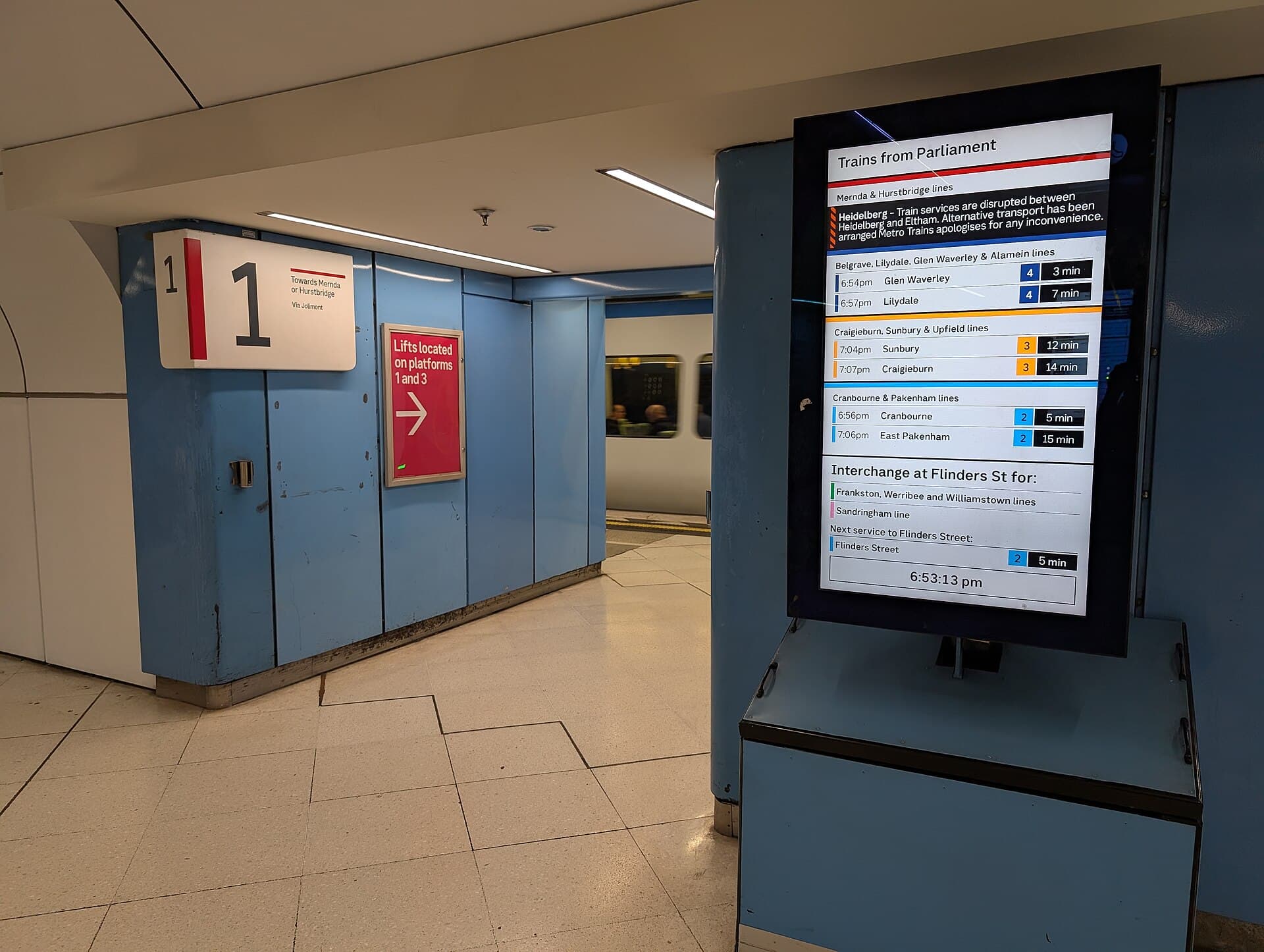
Hospitals, universities, stations, stadia, courts, local-government precincts: Australia runs a lot of places that strangers must navigate while already late, unwell, or carrying a bag. Those places have identities. They also have, too often, a wayfinding afterthought — a package of signs commissioned when the architecture is finished and the brand book has already gone to print. The visitor then meets two organisations. One has a calm website. The other cannot get them from the car park to clinic B without a volunteer.
Wayfinding is brand at walking speed. It is the organisation’s voice when the voice is a direction, not a claim. If the direction is late, contradictory or written in a dialect of project names, the claim was a lie.
Names are the first signs
Before a designer draws an arrow, someone has to name the places. Australian campuses are graveyards of names: donors, former vice-chancellors, project codes, “Building 14”, a wing that staff still call by the previous hospital’s name. Visitors do not share the archaeology. They share a phone and a time slot.
A wayfinding project that does not include a naming policy will fail. The policy should prefer durable, sayable names over honourific stacking. If a donor name is required, pair it with a functional name the public can use. Put the functional name in the appointment SMS. Put it on the sign. Put it in the mouth of the security guard. Three different names for one door is not heritage. It is cruelty.
Stations and precincts have the same problem at civic scale. Project names (a tunnel, a square, a “place”) leak onto signs before the public has adopted them. Old names persist in speech. The system has to choose which name does the work, and retire the others in sequence, not in a weekend.
Design for the person who is already tired
The user of wayfinding is not a design student with time. They are older than the render. They may not read English as a first language. They may be in pain. They may be on a platform with a pram and a delay. Contrast, size, height, lighting, and the decision to use words instead of a clever pictogram are ethical choices.
Digital is not a substitute. A wayfinding app that requires download at the entrance is an admission that the place failed. Use digital where it already lives: the appointment message, the platform screen, the map the university already forces students to open. Do not invent a second map with a different set of names.
Staff are part of the system. If the volunteer at the desk uses different words than the sign, the sign lost. Train the words. Write them down. This is cheaper than another totem.
Identity without dressing up
A wayfinding system can carry the brand — type, colour, a consistent panel — without becoming a costume. Hospitals that paint every wall in the primary are not more branded. They are louder. Stations that apply a fashion colour to safety information are not distinctive. They are dangerous.
Let identity live in the structure: a recognisable family of panels, a typeface that holds names and numbers, a colour used for orientation rather than decoration. Let safety information keep its conventional colours. Let regulatory signs be regulatory. Brand that fights a standard loses twice: once in compliance, once in trust.
The Australian examples that work are often the least theatrical. A university that finally numbered its doors in an order a stranger can climb. A hospital that aligned SMS, sign and spoken instruction. A station that repeated the same decision from street to platform. None of that photographs like a launch. All of it is remembered as competence.
Temporary places, events and the weekend campus
Australian cities also run temporary wayfinding: a tennis precinct, a writers’ festival, a vaccination centre, a disaster recovery hub. Those systems are built in a hurry and staffed by people who were not in the design meeting. Write a temporary kit — portable names, a type that can be laser-printed, arrows that work on a wet corflute — and keep it. Reinventing wayfinding for every event is how you get three names for the same gate and a volunteer who points with a frown.
Universities and hospitals have a permanent version of the temporary: decant spaces, pop-up clinics, a library in a demountable. The brand of the institution is whether those spaces still use the same words as the main door. If they do not, the visitor learns that the institution is only itself when it is photogenic.
Architecture is a partner or an enemy
Architects leave spaces that want to be photographed and corridors that want to be ignored. Wayfinding cannot rescue a plan that hides the entrance. Bring the wayfinding designer in before the concrete. If you cannot, be honest about the patches. A late system should not pretend to be a masterplan. It should be a humane patch with a date for revision.
Fit-outs and retail leases will fight you. A precinct that lets every tenant shout will have no civic voice. The brand of the place is the discipline of the leases as much as the totems. That is a management decision wearing a design problem.
Night and rain change every sign. If the precinct runs after dark — a stadium, a hospital, a station — test the system then. A pale panel that worked in a lunchtime photoshoot will vanish. Light is part of the identity specification, not a facilities afterthought.
The test
Give a person who has never been there an appointment card and twenty minutes. Do not walk with them. Do not let a staff member who knows the project hover. Watch where they hesitate. Those hesitations are the identity. Fix them before you redraw the mark.
A visitor who arrives calm has been branded more effectively than a visitor who arrives having seen a campaign. Wayfinding is how you buy that calm. Treat it as core identity, or admit that the brand stops at the car park.
Questions readers ask
- When should wayfinding be part of a brand project?
- Whenever the organisation owns or shares a place people must navigate — a campus, a hospital, a station, a stadium, a civic precinct, a large workplace. If the project stops at a logo and a website, you have branded the brochure and left the visitor to guess.
- What is the difference between signage and wayfinding?
- Signage is objects on walls. Wayfinding is the system that gets a tired person to the right door, including names, numbers, maps, staff instructions and the digital layer. A beautiful sign in a broken system is decoration in a corridor.