Australian journal · Est. 2004

Branding Agency

A journal of Australian brand strategy, identity and practice

Long-form essays for people who have to live with a brand after the launch deck.

Topic hub

Identity

The logo is rarely the problem. Identity is the system that survives fluorescent retail, a two-supermarket shelf, a station concourse and a typeface that does not pretend Melbourne is Brooklyn.

5 essays in this hub. See the full archive.

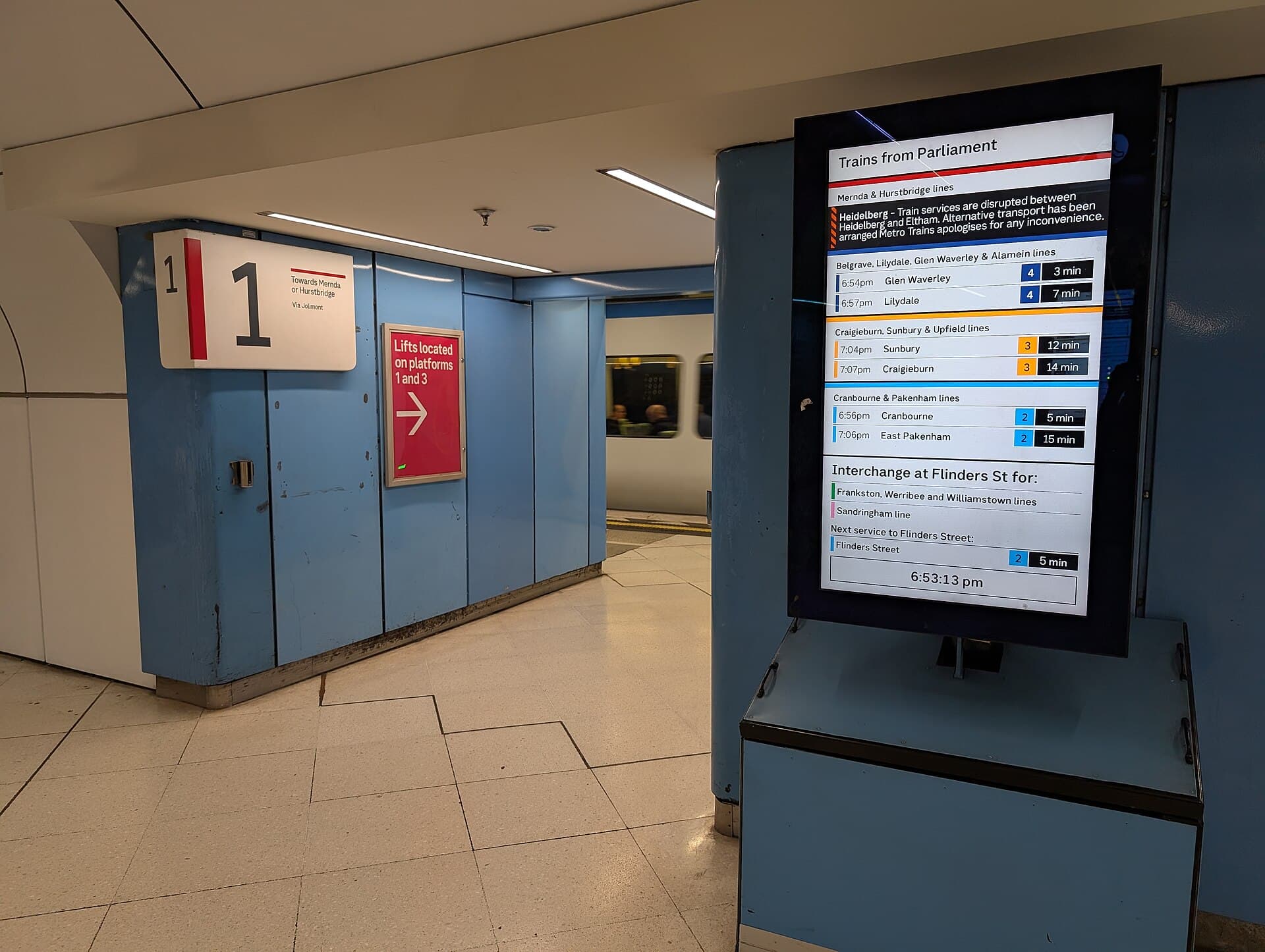
Wayfinding signs and a departure screen above a platform at Parliament railway station in Melbourne.

Identity/6 May 2026

Wayfinding as brand, not signage

A customer who cannot find the lift, the platform or the clinic has already met the brand. Australian campuses, stations, hospitals and precincts still treat wayfinding as a late signage package. It is identity at walking speed. Design it with the same seriousness as the mark.

Priya Nair · 5 min read · Read the essay

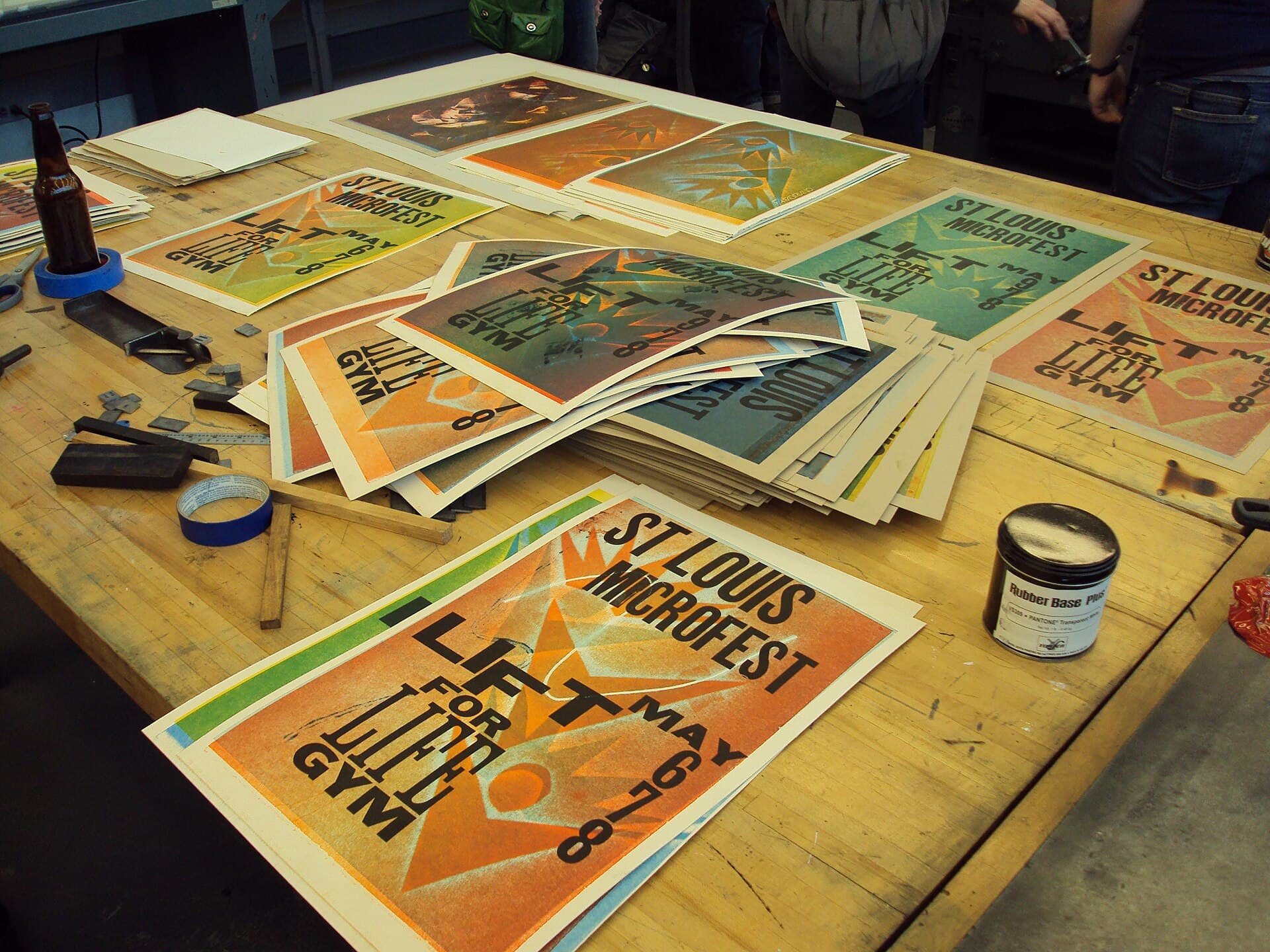
Stacked product boxes with bold graphic packaging on a studio surface.

Identity/1 April 2026

Packaging in a two-supermarket country

In Australia the pack is not a lifestyle object. It is a negotiation with two buyers, a hostile aisle and a printer who will not reprint for a 0.3 millimetre poetry. Distinctive is possible. Naive is expensive. Design the pack for the shelf that exists.

Priya Nair · 5 min read · Read the essay
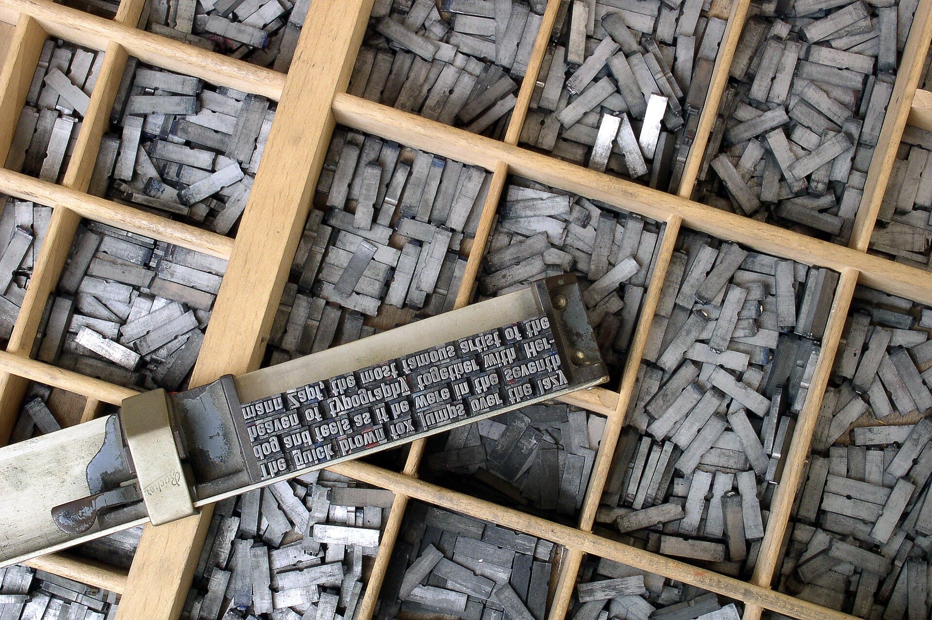
Close-up of metal movable type letters arranged in a case.

Identity/11 March 2026

Typefaces that do not pretend we are in Brooklyn

Australian brands keep buying the same international sans, then adding a slang glossary to prove they are here. Type is a civic choice. It has to work on a form, a fascia and a phone, in a country that already has a typographic climate. Distinctive does not mean imported.

Tom Whittaker · 5 min read · Read the essay

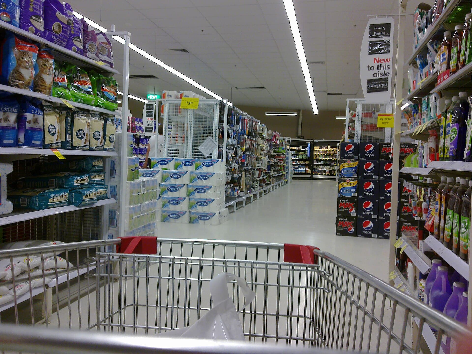
A supermarket aisle with stocked shelves receding under bright store lighting.

Identity/18 February 2026

Colour systems that survive fluorescent retail

A palette that looks authoritative in a studio will die under a supermarket, a hospital corridor or a service-station canopy. Australian identity work has to specify colour as it will be printed, lit and cheaply reproduced — not as it appears in a well-calibrated deck.

Priya Nair · 5 min read · Read the essay