The logo is the least interesting part of an identity
Australian rebrands still get announced as if a mark were the work. Customers meet a van, a login, a hold message and a shopfront that has not been painted. Identity is the system those surfaces share. The mark is a handle. Treat it like one.
Priya Nair, Identity Editor · 21 January 2026 · 5 min read
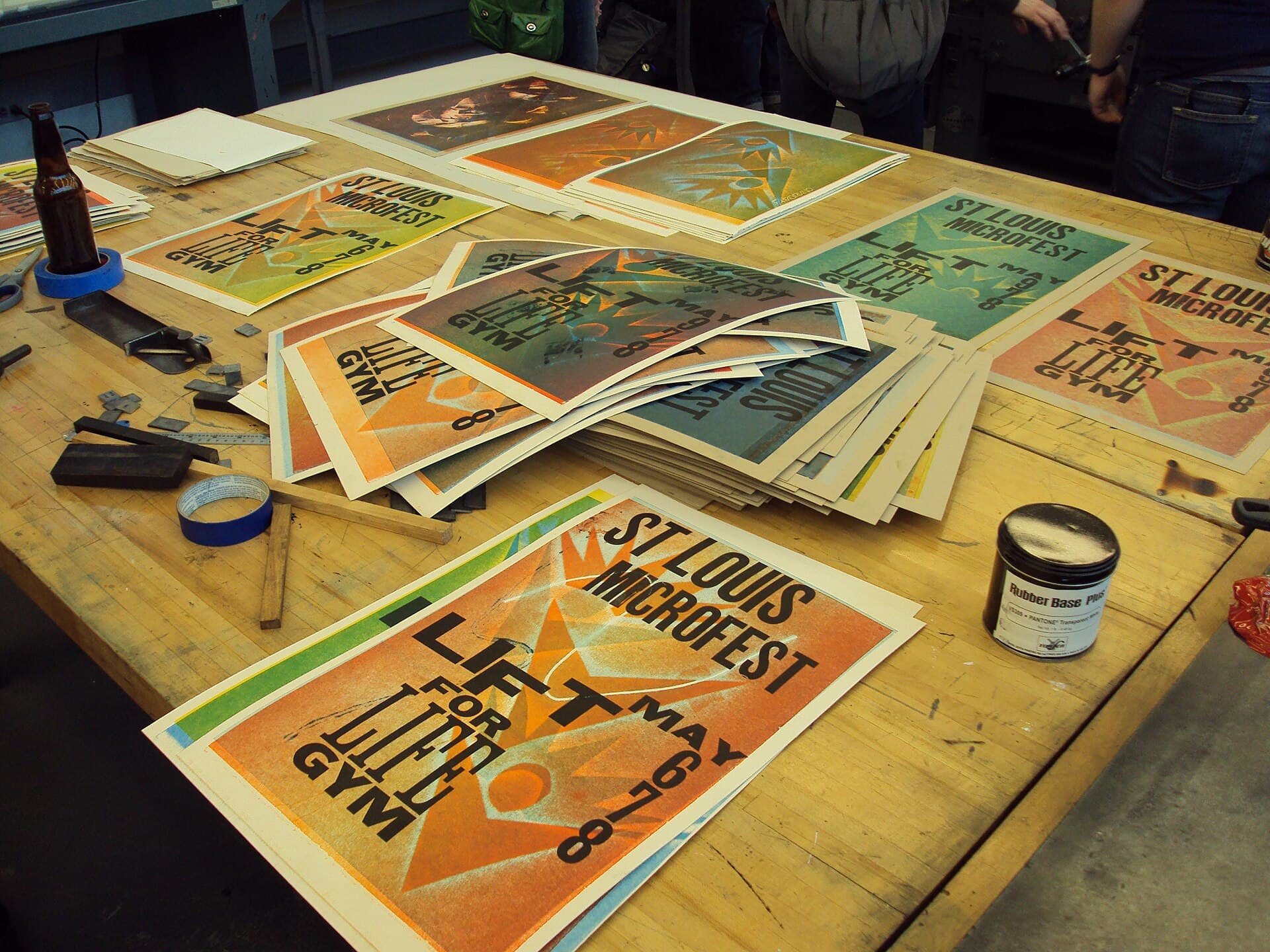
A rebrand in this country is still, too often, a press release about a logo. The mark is unveiled. The agency explains the hidden meaning of a curve. A journalist writes a paragraph. Social media performs a short, ritual disgust. Then Monday arrives, and the customer meets the same login, the same hold music, the same unpainted fascia, the same PDF with last year’s letterhead. The logo was interesting for a weekend. The identity never showed up.
This is not an argument against marks. A good mark is a handle: compact, reproducible, able to sit on a hat and a building without becoming a different animal. The argument is against the superstition that the handle is the work. Identity is the set of decisions that make a van, a form, a shopfront and a paragraph feel like the same organisation. Most of those decisions are boring. That is why they are valuable. Boring decisions compound. Clever marks get redesigned.
What customers actually meet
Start the identity project with an inventory of surfaces, not a mood board. In a mid-market Australian organisation the list is predictable and unromantic.
The place: fascia, reception, vehicles, wayfinding, the back of the shop that faces a car park. The paper: invoices, tenders, policies, packaging if you have it. The screen: the login a customer already has, the app icon, the email, the 404, the chatbot that will ignore the voice guide. The voice: IVR, hold, complaint, job ad. The people: badges, uniforms, the lanyard a visitor is given.
If the new mark cannot be applied to those surfaces in the first ninety days — legally, operationally, financially — you do not have a new identity. You have a launch asset. Customers are not confused by a new curve. They are confused by two companies occupying the same week.
Qantas, Australia Post, the banks, the universities: their public arguments about identity are rarely about draughtsmanship. They are about whether the organisation that shows up is the one that advertised. A kangaroo can be redrawn. A delayed bag cannot.
How the logo ate the project
The logo is votable. A board can choose between three marks in a sitting. It cannot, in the same sitting, choose a vehicle program, an IVR script and a document system. Agencies know this. They put the mark at the front of the process because it is the artefact that looks like strategy to people who do not run stores.
The secondary reason is cultural. Australian design education still treats the mark as the prestige object. Students can spend a term on a symbol and a week on a form. The industry then repeats the education at commercial scale. We get better at meaning and worse at reproduction. A mark that only works at 400 pixels on a retina screen is not a mark. It is an illustration.
The third reason is procurement. It is easier to buy a “rebrand” than to buy a three-year surfaces program. The purchase order wants a deliverable that fits in a brand book. Surfaces are maintenance. Maintenance does not get a night in a gallery.
Build the system in the opposite order
Design the surfaces first, at real sizes, in the real light. The supermarket aisle, the hospital corridor, the truck on a highway, the PDF someone will print on a dying toner cartridge. Then extract the mark, type and colour that can survive those rooms. You will get a less poetic symbol and a more honest company.
Write the reproduction rules as engineering. Minimum sizes. Forbidden backgrounds. What happens when the only printer is black. What happens when a sponsor wants to sit next to you. What happens when a state team needs a lock-up for a program that will last eleven months. These rules are the identity. The mark is one line in them.
Give type and colour the same dignity you give the symbol. A distinctive typeface, used consistently on ordinary documents, will do more work than a clever monogram used once on a launch film. A colour that can be matched by a signwriter in Dubbo is more valuable than a colour that exists only in a coated-stock fantasy.
Partnerships, lock-ups and the death of the handle
The mark dies most often not in a redesign but in a lock-up. A government program, a charity week, a stadium, a co-branded credit card: each asks for the handle to sit next to another handle in a way that implies a joint venture, an endorsement, or a merger. Write the lock-up rules as law. Equal weight or a clear host. A time limit. A background that does not invent a third colour. A refusal for partners whose conduct you will inherit. If you cannot refuse, you do not have a mark. You have a sticker other people will use.
Internal lock-ups are just as lethal. Every business unit wants a version. A house of brands can bear that. A branded house cannot. If the architecture slide and the lock-up rules disagree, the lock-ups will win, because they ship.
When you should change the mark
Change it when you cannot own it — legally or in the mouth of the market. Change it when it will not reproduce, or when it names a firm that a merger has made untrue. Change it when it is so bound to a discredited period that staff will not wear it. Do not change it because a new chief wants a chapter. Do not change it because a trend cycle has moved from flat to brutalist and back.
If you do change it, spend the announcement money on the surfaces. Photograph the van, not the unveiling. Publish the schedule for fascia. Tell customers what will look different on Tuesday and what will take a year. Honesty is an identity asset. Mystery is how you get a weekend of commentary and a year of mess.
The interesting work
The interesting work is the system: the decisions that make an organisation feel like itself when nobody from the agency is in the room. That work is unglamorous, local, and resistant to a press release. It is also the only part a customer can confirm.
A mark can be beautiful. It should be. Beauty is a kindness to the people who have to look at it every day. But beauty that cannot travel — from a launch night to a depot — is decoration. Identity is travel. Design for the depot.
Questions readers ask
- Why do Australian organisations spend so much time on the logo?
- Because it is the one artefact a board can vote on in an hour, and the one a newspaper will reproduce. Vans, IVRs and staff badges take longer and look less like a decision. That is why they are neglected, and why customers still meet last year’s company.
- When is a new logo actually required?
- When the current mark cannot be owned, cannot be reproduced, or names an organisation that no longer exists. Taste, a new chief and a desire to look contemporary are not requirements. They are how identity budgets get spent without changing a surface.